After experimenting with the Luke Saxon idea, I started to feel like the images were working well by themselves. Although I want this to be a sort of diary/journal, I think it actually works better without the text. As a photographic piece, I don’t think the images need to be displayed with the text; I feel as though the beauty of photography is that the pictures speak for themselves. Therefore, I’ve decided to take the text out and just continue experimenting with the layout of the photos.
I really like the examples where the images are bigger and fill most, if not all of the page. Filling the page also adds to that ‘passive’ framing technique that Stephen Shore talks about, as it gives the image potential to exist beyond the edges of the book.
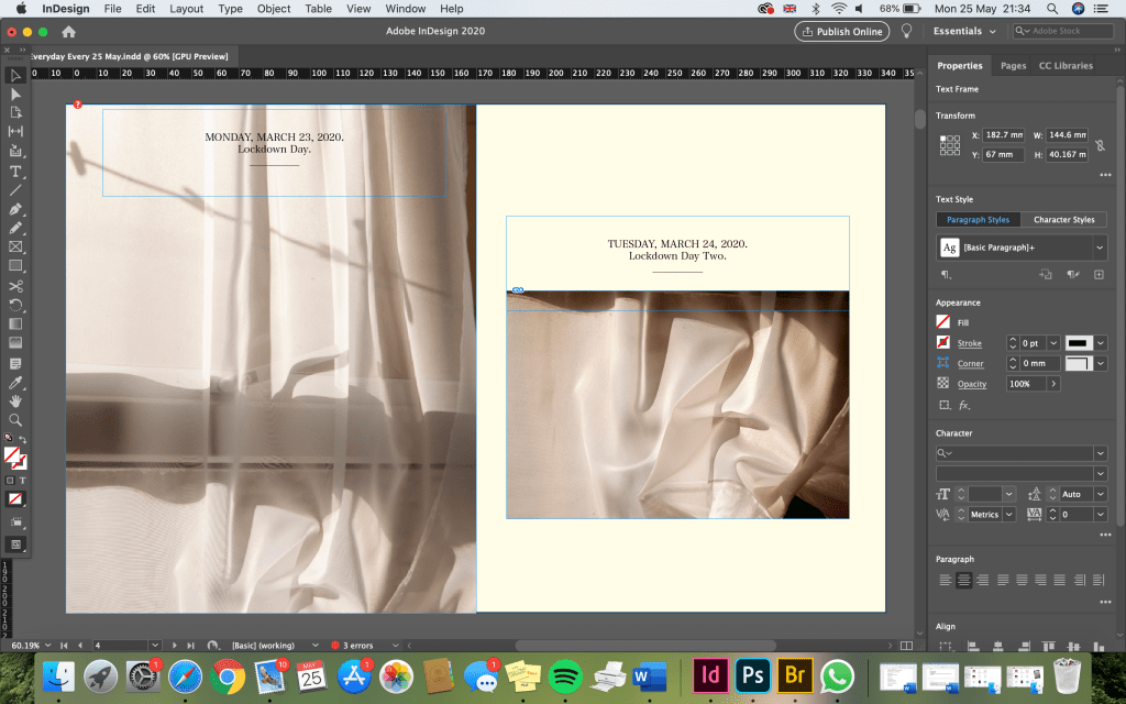
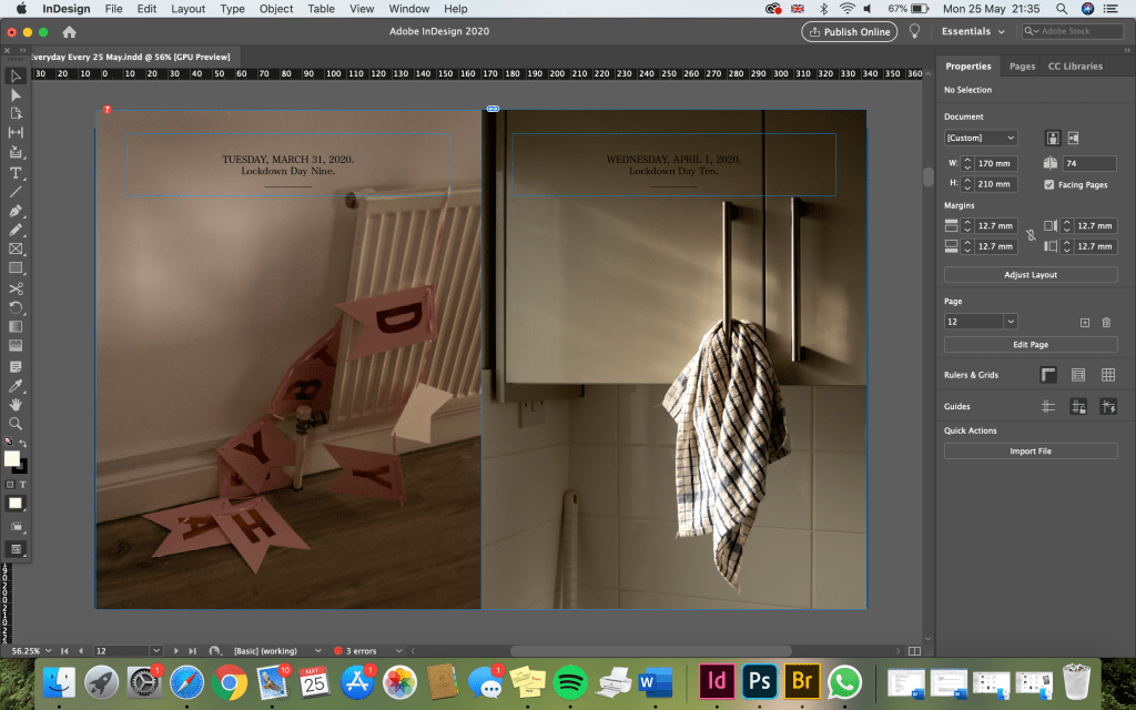
Although I’m not including the diary entries anymore, I am going to include the dates and the day of lockdown at the top of the page still. I think this still creates the sense that you are looking through a diary; but instead of words, the entries are photographs. I can still use photos for each page that reflect what the diary entry would have been for that day. For example, on the day it was someone’s birthday, I can use the birthday banner photograph, or on the days I was feeling a bit trapped or down, I can use dark, shadowy images that emit these emotions.
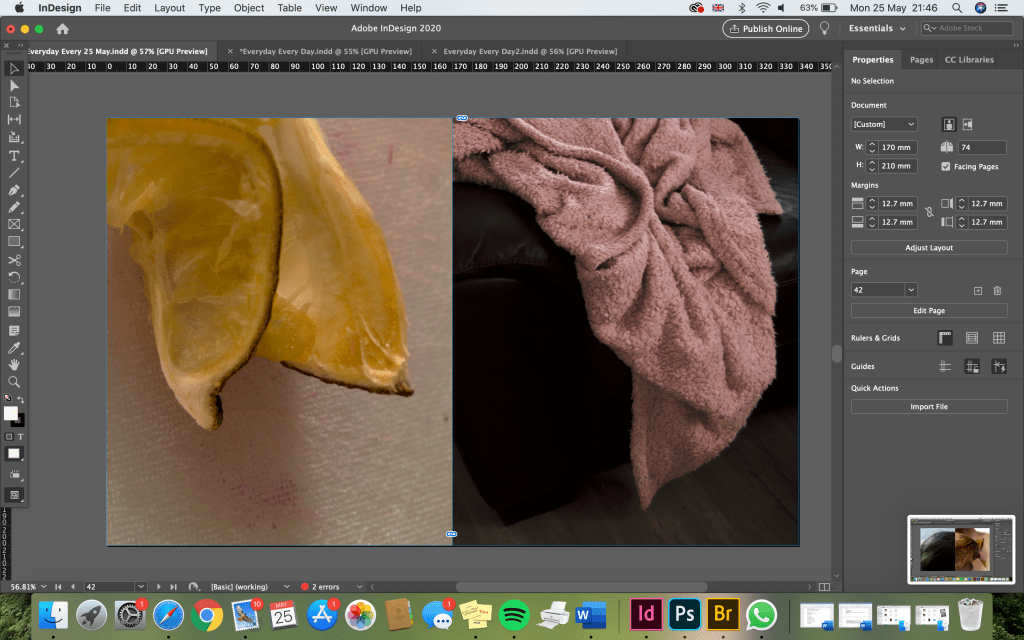
Here (below) I have used just one image to fill a double page spread. I think this works well and I would like to do a combination of these types of spreads and of the spreads with two images. I have a lot of landscape photos so this will work well. I also have a few very strong images that I feel deserve a double page spread.
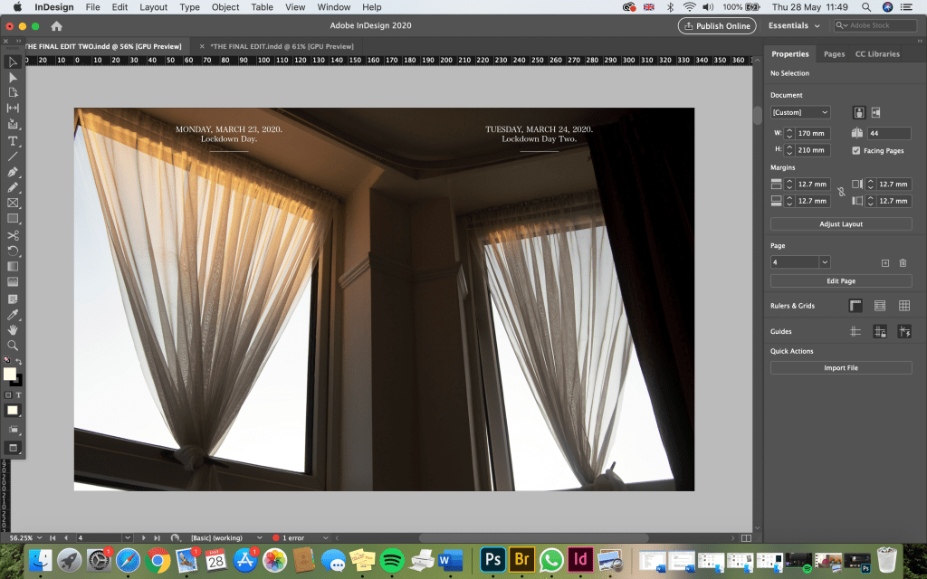
Although there are still two dates, and only one image, I think this still works. For me, it adds to the idea that a lot of the days in lockdown have seemed to blur into one, which is something I mention a lot in my diary entries. I hope that the people reading my book will pick up on this also.
I made the dates at the top white instead of black as this contrasts nicely with the image. I would like this to remain consistent throughout the book, so I will stick with this.