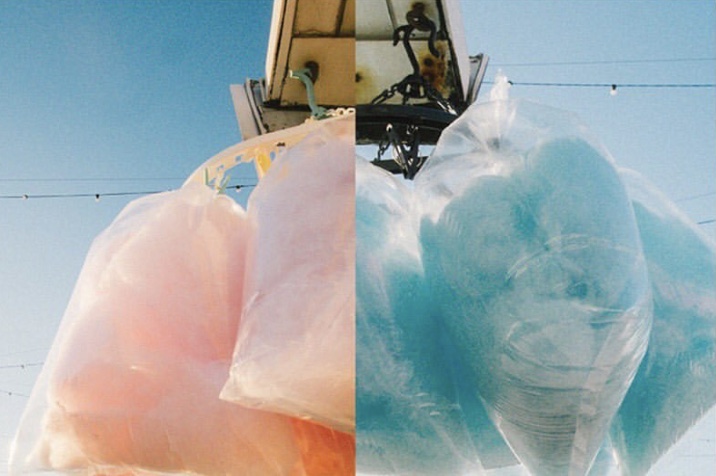
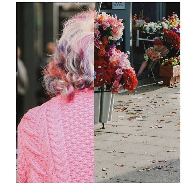
When I was looking at Luke Saxon’s work earlier on in my project, I spoke a little about his side to side edits that I’d found on his Instagram profile. I love the way this looks; the satisfying colour pairings and the often humorous outcomes. I definitely have a lot of images that work well together, in terms of colour, lighting and style, and of course they are all taken within the same setting. So, I thought it would be interesting to try pairing some of my photos together. This might be a way to consider arranging my photos on the double page spreads in my book.
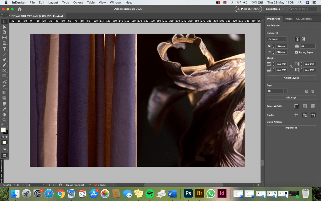
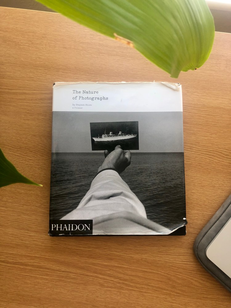
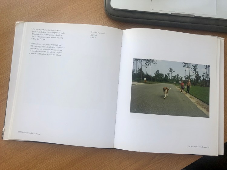
I haven’t included any text yet, as I wanted to focus on the layout of images first. I’ve also filled the pages with the images and often cropped and enlarged some of the photos so that they continue beyond the frame. I actually really like this style, for me it is reminiscent of the way Eggleston and Shore often haphazardly frame their subjects. I think it makes the photos look less constructed and thought about and more ‘everyday’. It also gives the impression of a world continuing beyond the frame – the frame acts PASSIVELY. In his book, ‘The Nature of Photographs’ (below), Stephen Shore describes ‘passive’ framing by explaining that ‘the structure of the picture begins within the image and works its way out to the frame.’ He actually references an images by William Eggleston as an example of this; explaining that ‘the photograph’s structure implies a world continuing beyond its edges.’
Below, are some examples of my experiments with this idea inspired by Luke Saxon. I have tried to pair the images in terms of either their repetitive imagery, similar colours, similar subjects, textures, patterns etc. I think these work really well and I would definitely like to include some of these in my final book! I just need to think a bit more now about how the text will fit into this.
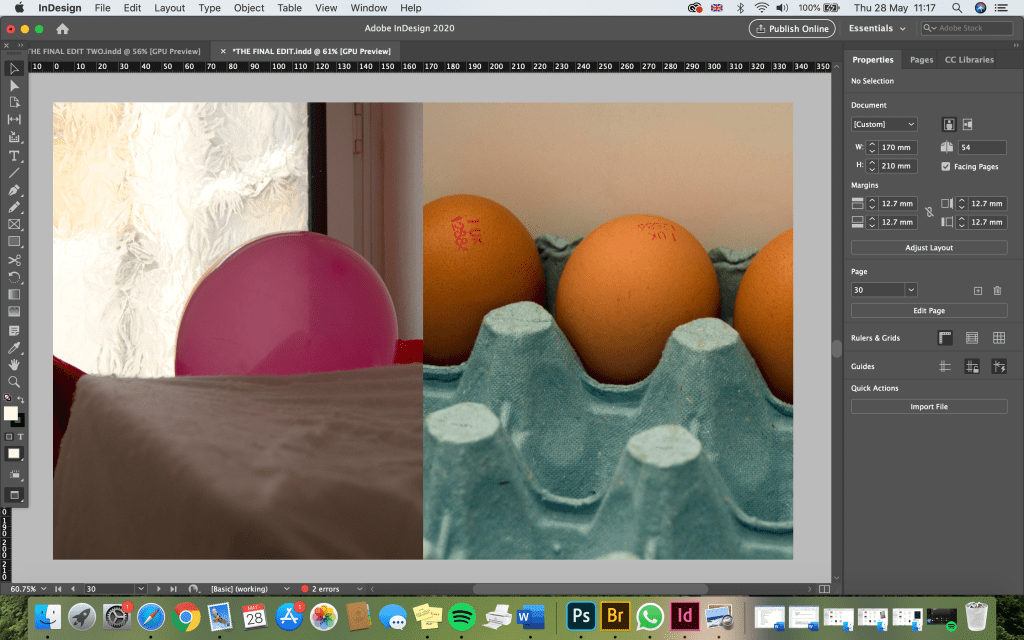
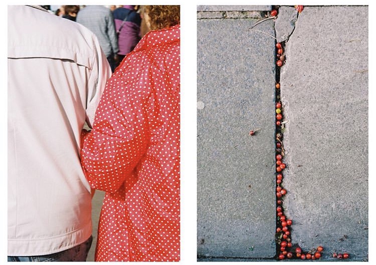
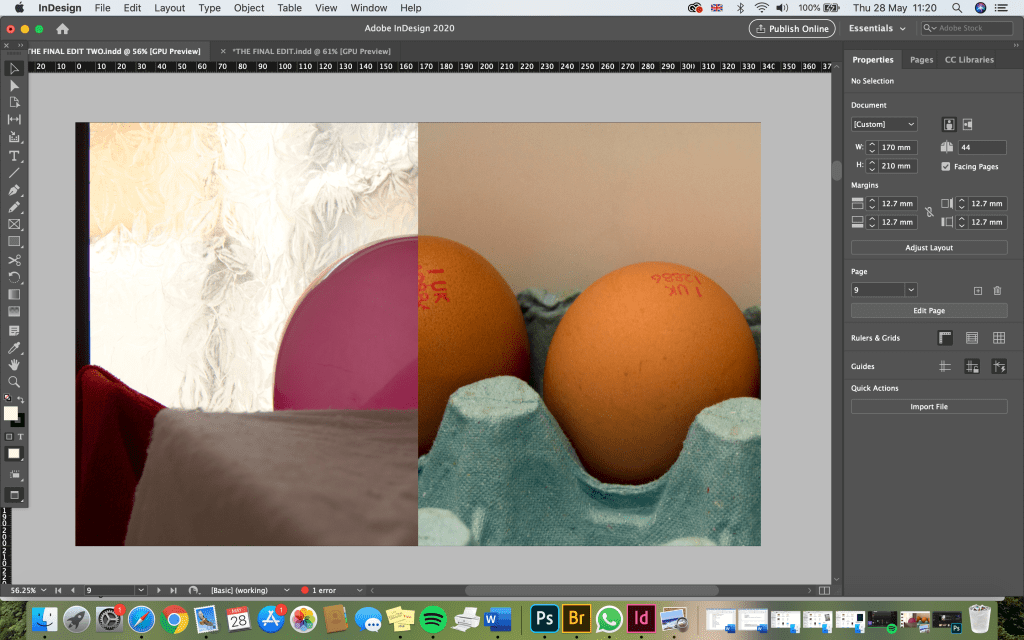
I tried two different examples of this edit. I actually really like both. The one below works well because it joins together well, however the one above may be enough simply because of the repetitive shapes that work well side by side.
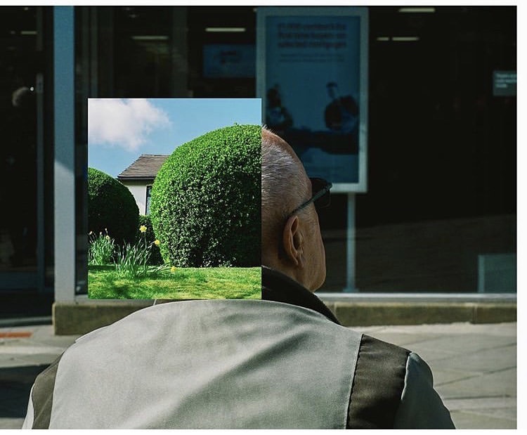
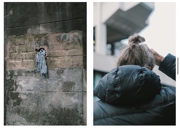
I tried to do a few different edits where the photo on the left joins up with the one on the right in some way. I think these work really well and add another interesting element to the book.
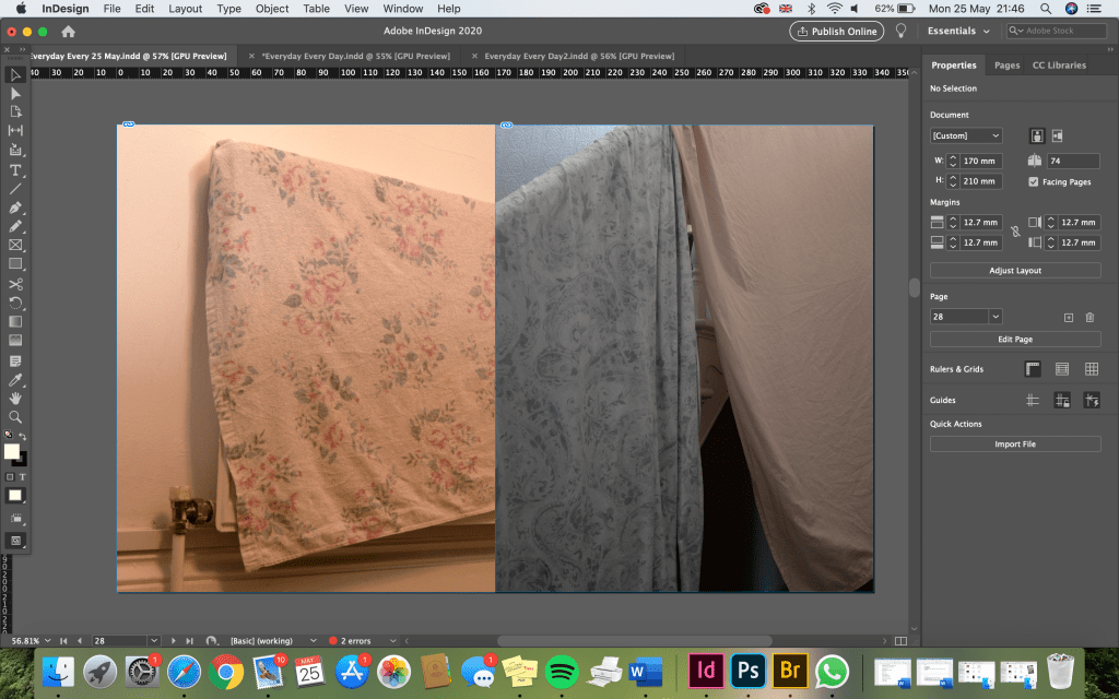
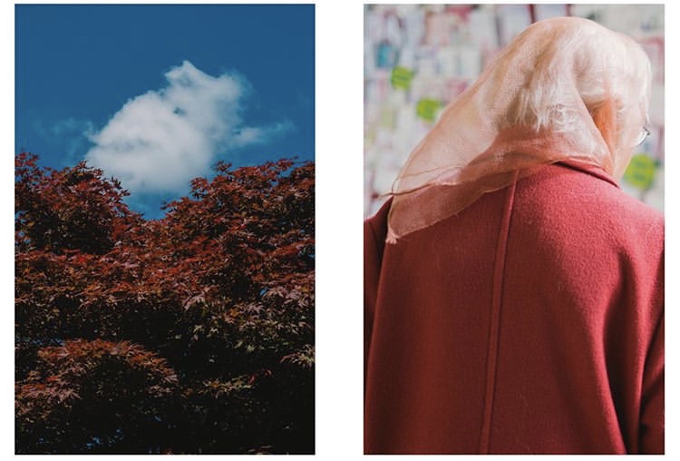
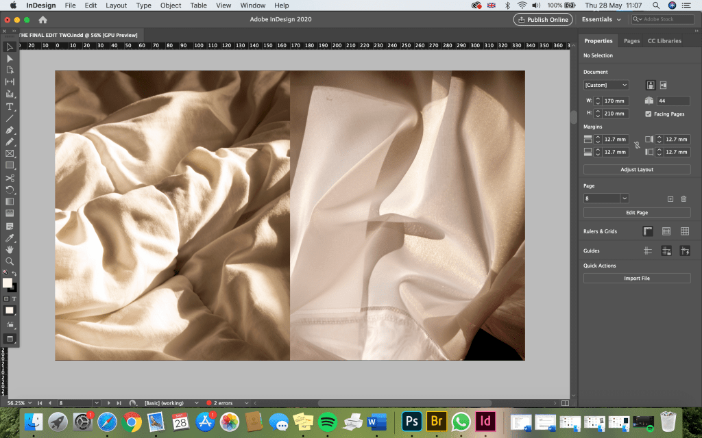
A lot of the pairings I did were also just based on similar colours, lighting, textures and patterns that I feel work well together. In the below edit, for example, the colours and lighting and similar as well as the scrunched up textures and patterns of the duvet and curtain. Although two different subjects, the two photos are very similar, showing a consistent style and theme in my work.
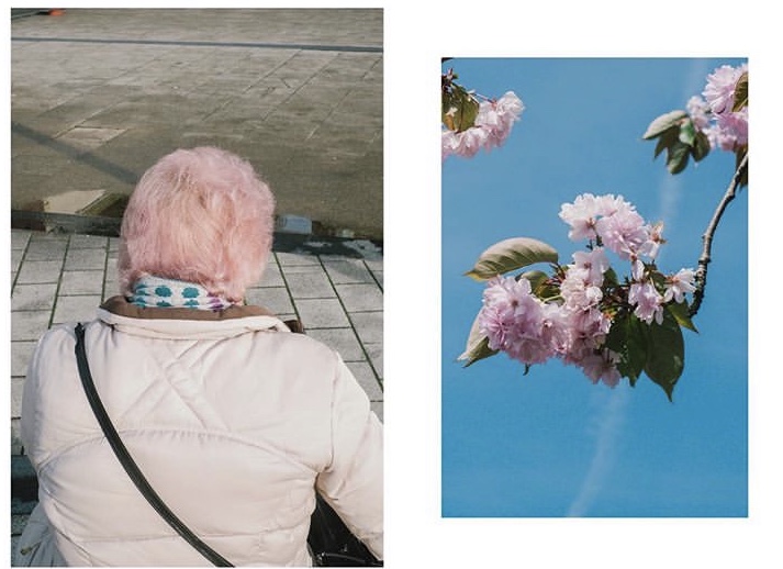
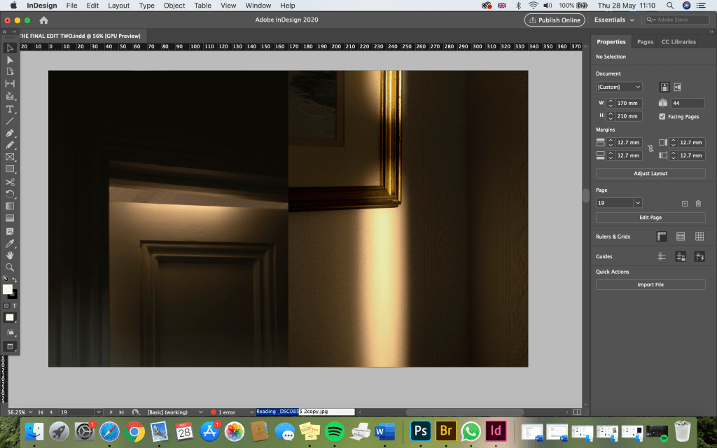
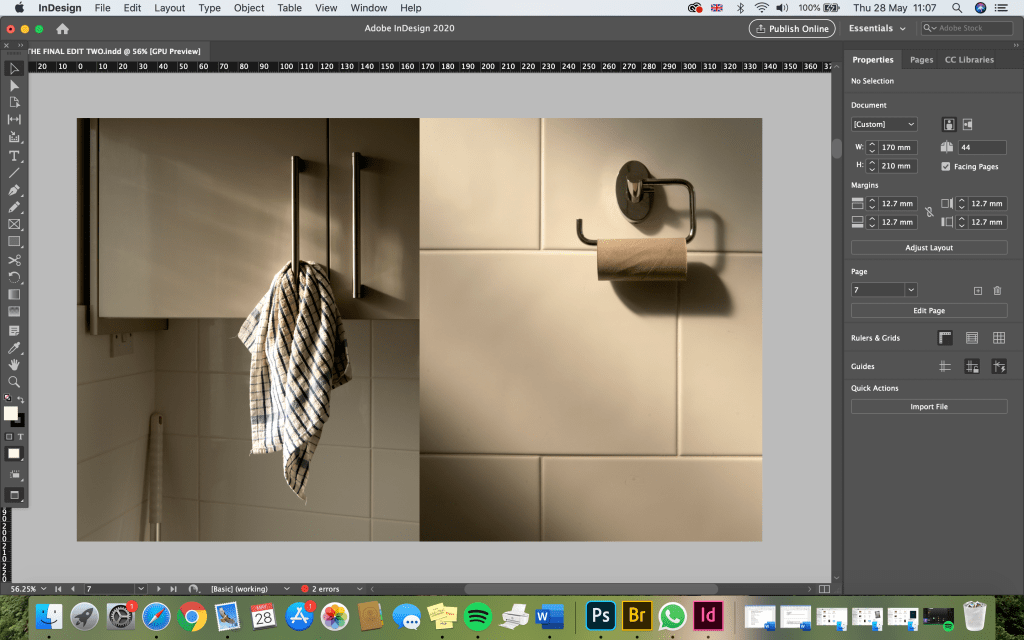
I put these two images (below) together because I think they’re very visually similar. The lighting, shadows and colours create the same sort of mood and the similar tiles add that element of repetitive imagery.
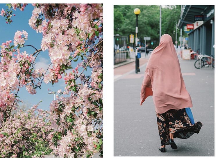
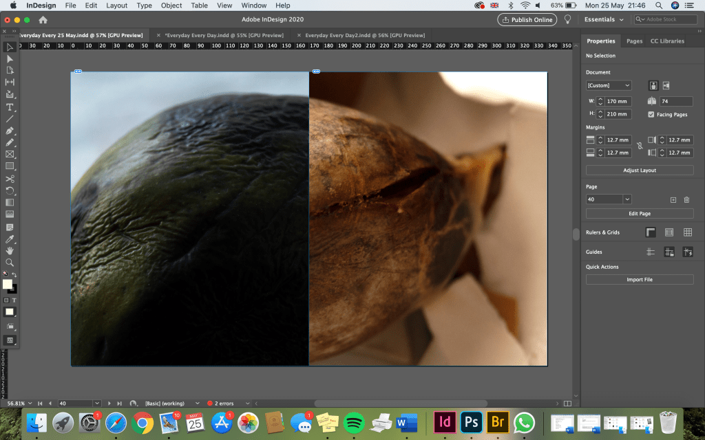
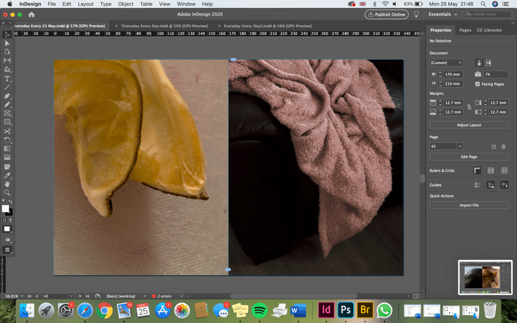
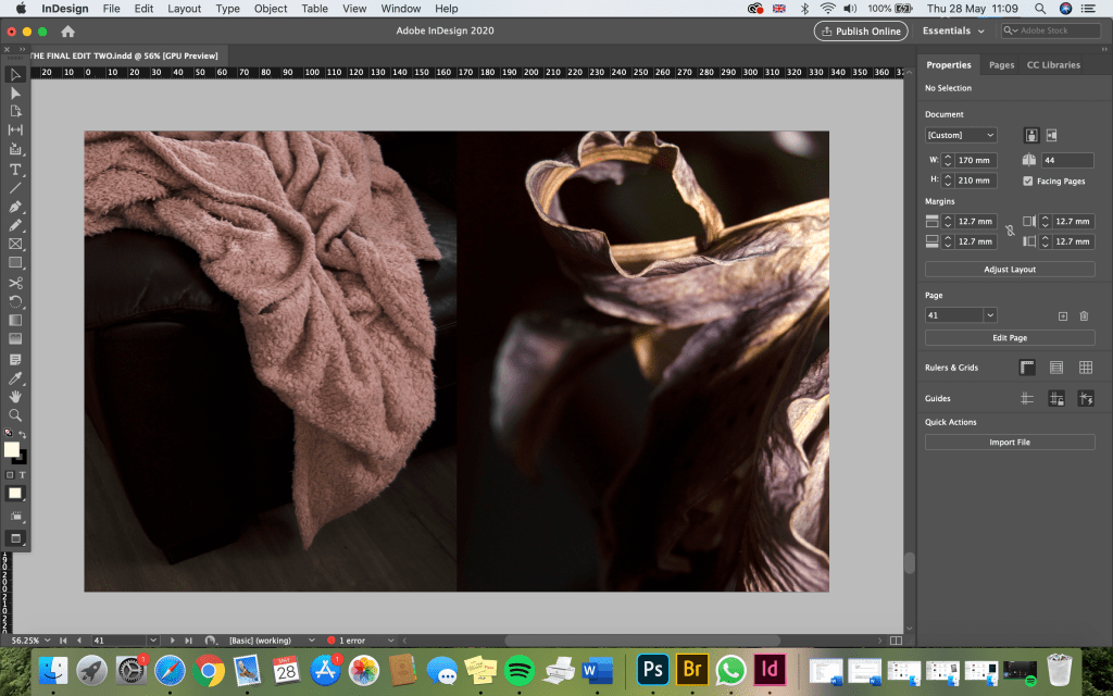
This blanket photo was quite interesting because it looks like it could be something else. I flipped the lime photograph to replicate the shape of the blanket and I think it’s quite interesting! The blanket also reminds me a lot of a flower petal, so I think it work very well next to the image of a flower. These are some of my favourites because it shows how ordinary objects can become something else entirely if you use your imagination.
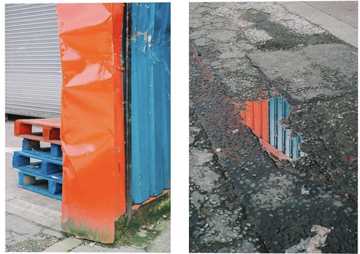
I like this edit (below) because the colours work well together.