The next step to creating my book, is to design the pages. I went with the off-white colour for the pages because I feel this is most appropriate for a diary/journal style book and compliments my photos nicely. To start with, I’ve just been trying lots of different layouts of images and styles of fonts to see what works best. I like the pages where the images are as big as possible, because I don’t want the text to take attention away from the photos, however it needs to be readable. Perhaps I could also try overlaying the text on top of the images?
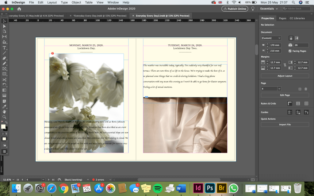
I decided to put the dates at the top of each page as if it were a day-by-day diary. I like the look of this a lot.
For the diary entries, I started with a simple font, which is easy to read and doesn’t draw attention away from the photos. However, I decided this was a little too basic and didn’t shout ‘diary’ to me.
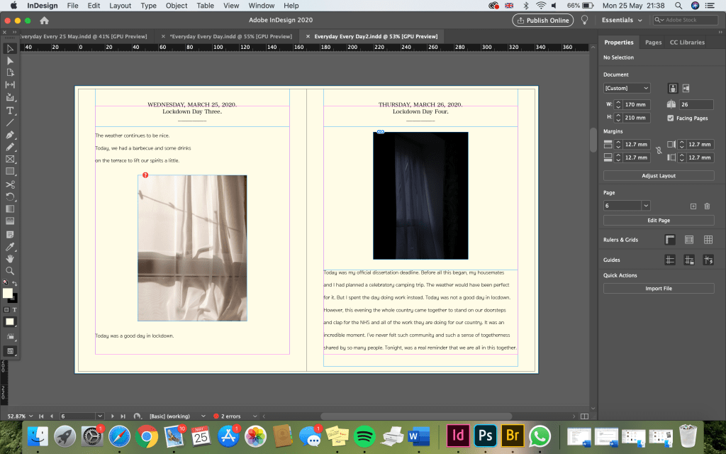
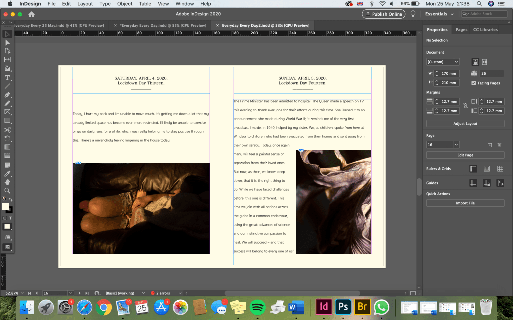
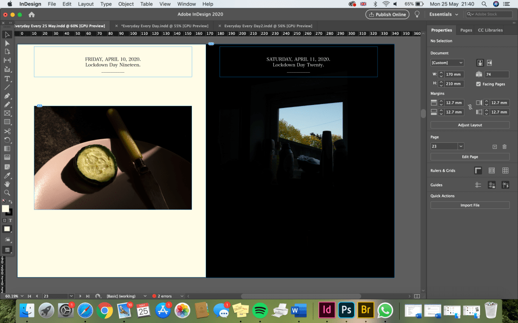
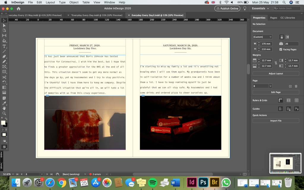
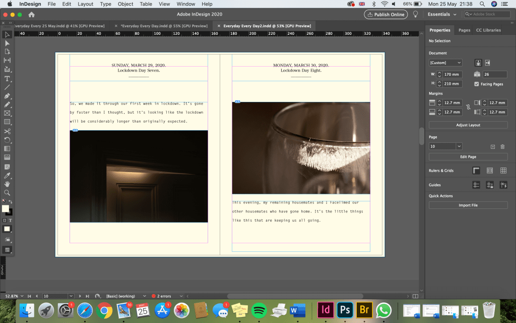
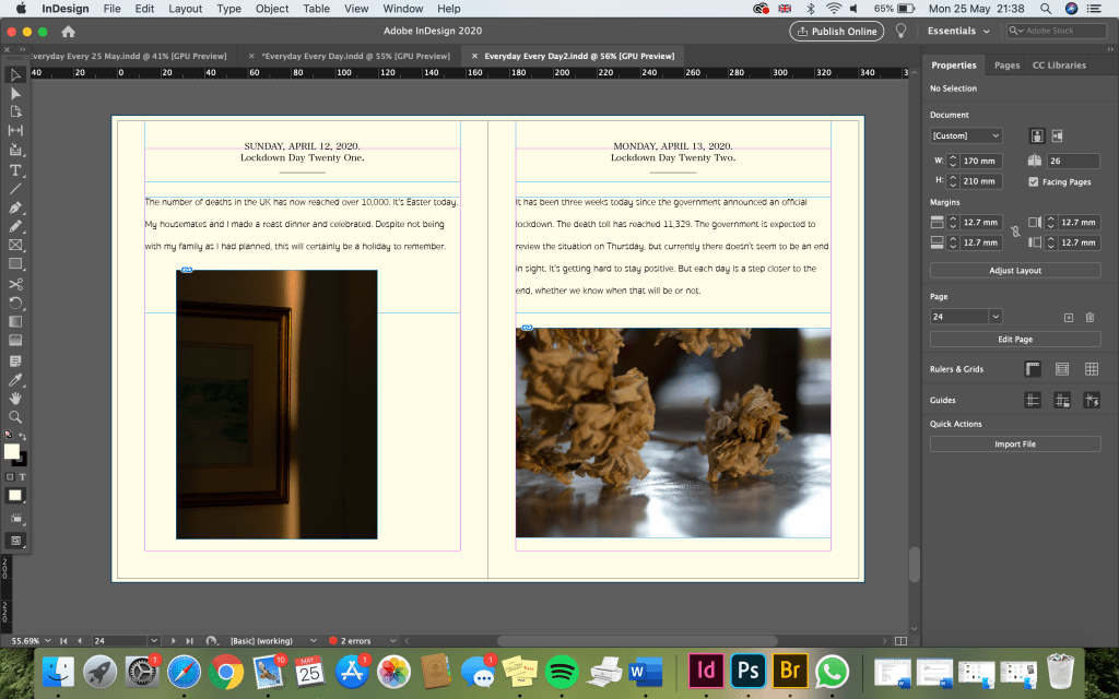
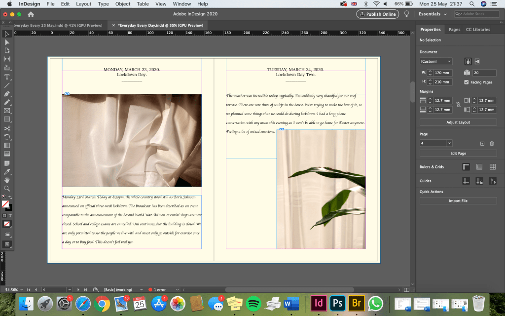
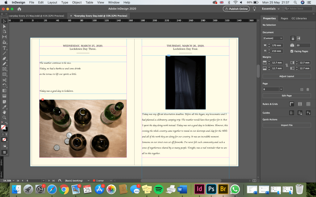
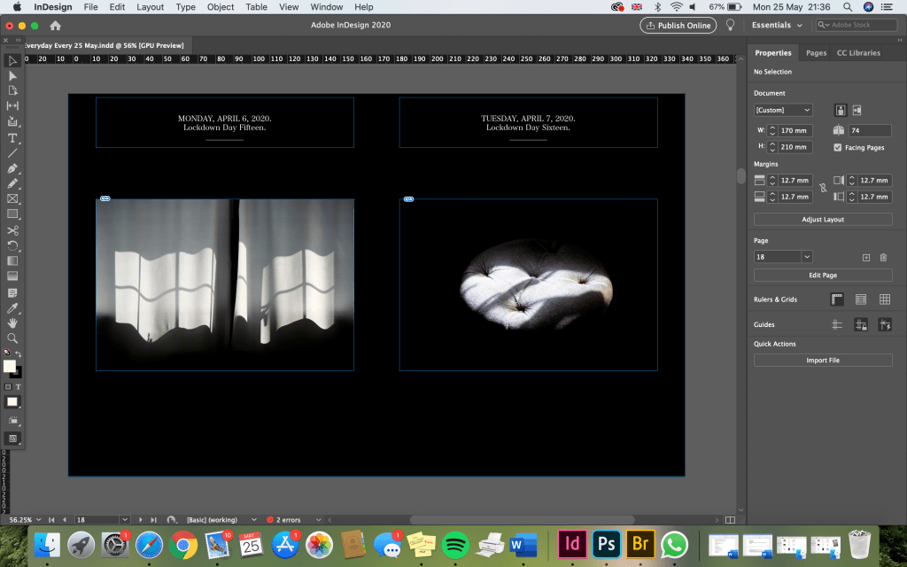
Next, I tried a slightly more spaced out, typewriter style font (below). It’s still simple, but I think I prefer this because it looks more like a diary. I also much prefer that the photos are slightly bigger in these examples. I tried to order the photos so that the colours work well together on a double page spread, and also used photos which were taken on that day or relate to what is being said in the diary entry.
I also tried this handwritten style of font (below), which is my favourite outcome so far. Ideally, had I been making the real book, it would have been nice to be able to write the diary entries by hand or at least scan them in. However, with the resources I currently have, the easiest way to make it look like handwritten notes is to use this type of font.
I tried to make the image on this page (below) a lot bigger so that it would fill most of the page. Although I want to include diary entries, it’s still important to me that the photos are not lost amongst the text, as this is intended as a photographic piece of work. I thought it would be interesting to try and overlay the text on top of the image, however this makes the text quite difficult to read. I will have to put more thought into how this idea might work.
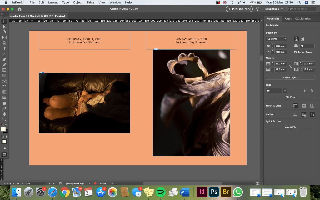
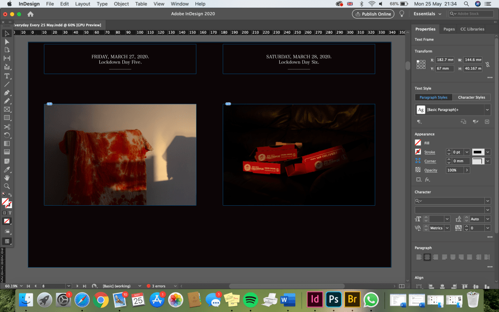
Finally, I tried a few more colours for the pages. I tried a peachy colour, to go with the neutral colours in my photos, and some darker colours too. I haven’t included the text here, because I immediately felt that these didn’t work as well as the off-white colour above.
I made the text here white, to contrast against the dark background, which works well. If I was to use a different colour, or overlay the text, I would do this again.
I also tried filling the page with the image here (below), which I really love. I could still put text on this page in the dark space and it would be easy to read. However, this wouldn’t work so well for all of the images. I will have to experiment more with the sizing and spacing of the images and text.