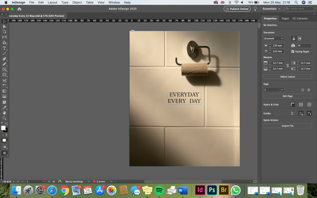
TITLE: For the title of my book, I have decided on ‘EVERYDAY EVERY DAY’. I think the repetition of the words looks interesting on the page and makes the viewer think. It also clearly expresses what I want to say. The ‘everyday’ of course refers to the subject of the photographs and ‘every day’ implies that the book is a visual diary of each day. Although some of the photos weren’t taken during lockdown, most of them were taken on different days. I want the book to act as a journal of each day, to show there is something ordinary to find beauty in every day. I also want the book to represent my time spent in lockdown and will include dates and diary entries on each page a long with photos that best represent that day.
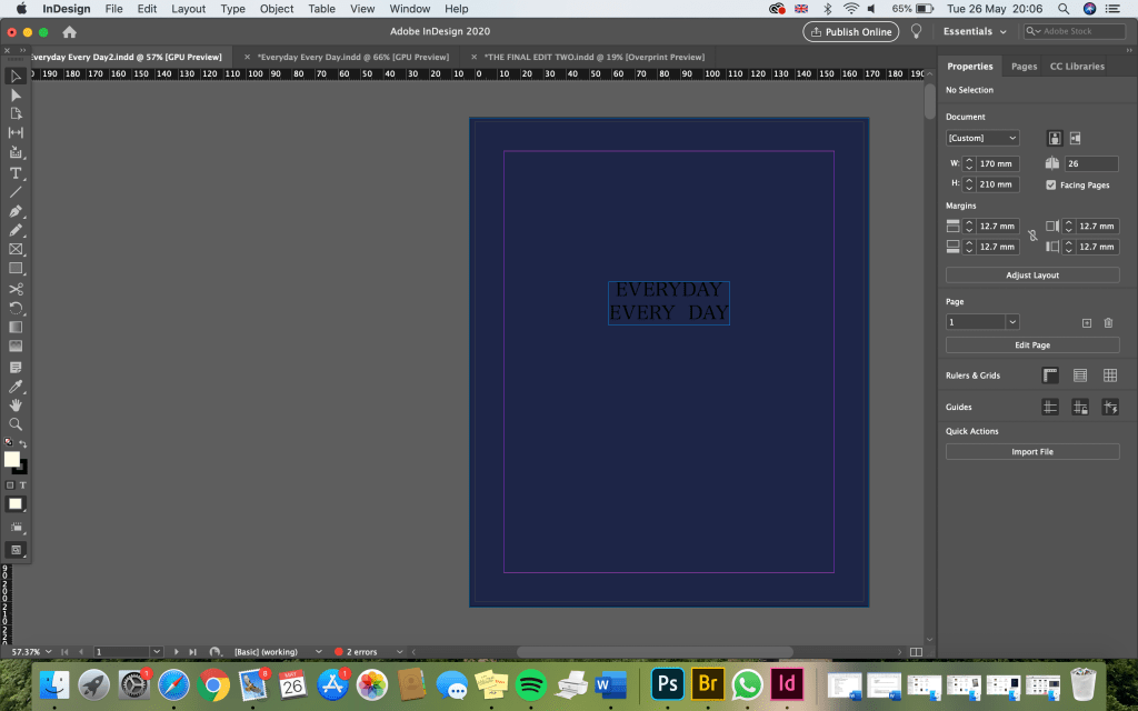
I’ve started by experimenting with front and back covers (below). I started out with a simple dark blue colour. I think blue is a fitting colour – a lot of the diary examples I looked at last week were blue and it also represents the NHS, which has obviously been an important area of discussion since the pandemic began. Although I don’t want to make the book entirely about the pandemic, it’s nice to tie in some of the ideas. I used a simple/easy to read font for the title, which I think works well. However, the black is a little difficult to read against the dark background.
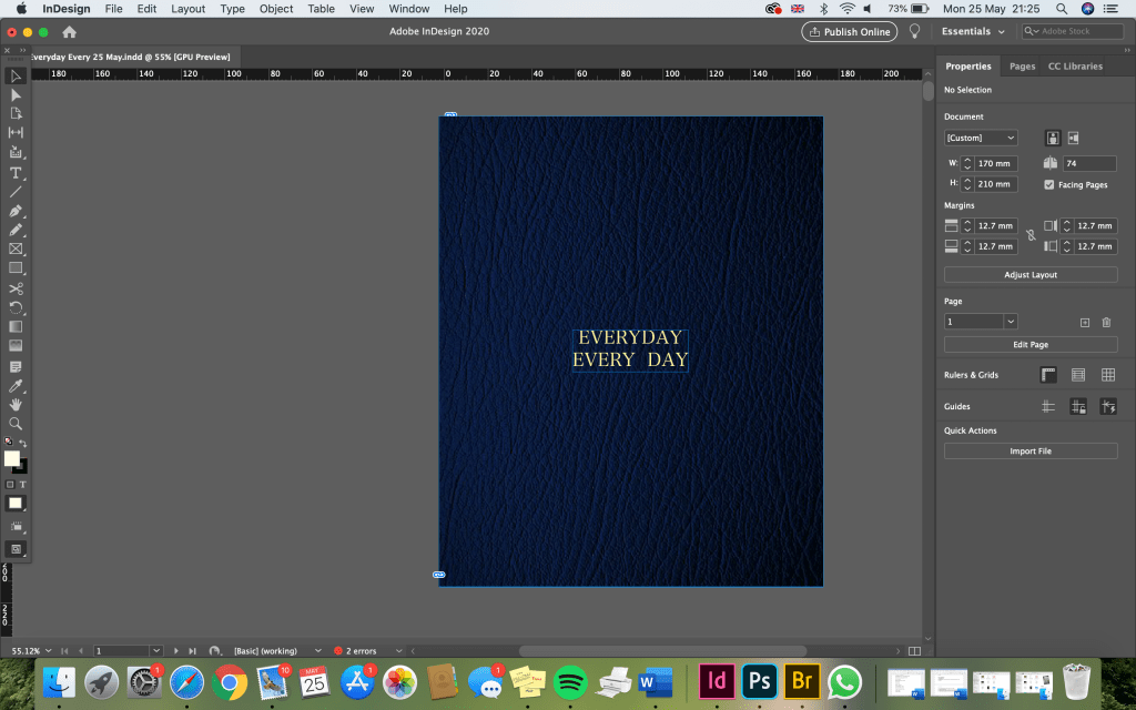
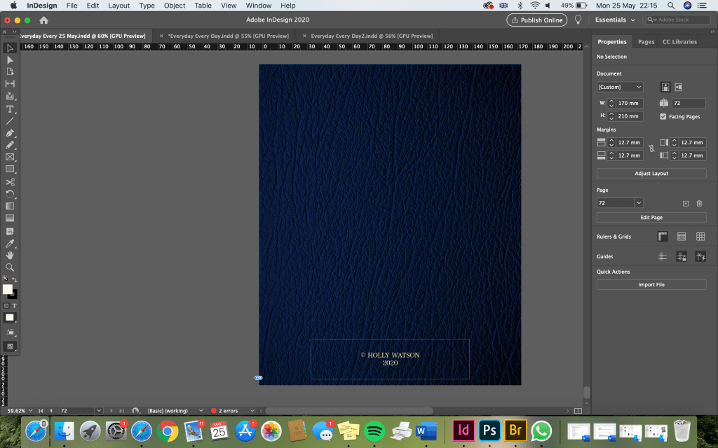
As I continued to experiment, I decided the front cover needed a more textured appearance. I’ve tried to consider the types of materials I would use if I was able to make a real book. Most of the diary/journal covers I looked at last week were made of leather, so I found some leather textures and applied them to my InDesign book. I think I prefer the dark blue colour best (third down). However, the text needs to be a little higher – similar to where it is on the black leather cover.
I also changed the colour of the title to a golden colour, as this was another common feature of the examples I looked at last week.
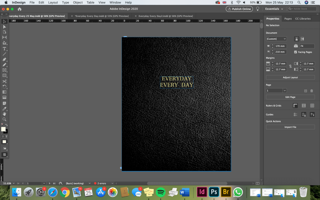
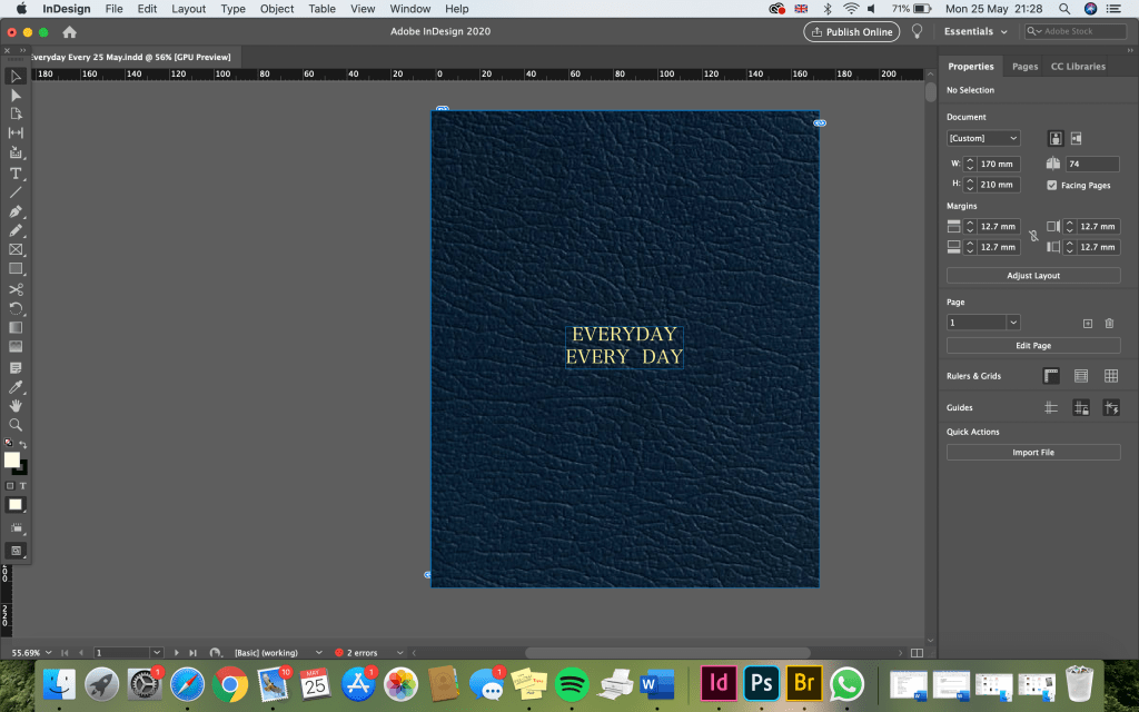
This colour and texture (below) is my favourite.
I also tried putting one of my images on the front cover. I decided on the toilet roll image as it’s a very meaningful photo that relates to the situation we are in due to the pandemic. There’s also plenty of empty space for the title and I think it’s a strong image with appropriate colours and lighting that link to the rest of the images nicely. However, I’ve decided against using an image for the front cover because I really want the book to feel like a journal/diary and this isn’t a common feature of those types of books.
BACK COVER
I preferred this blue colour and texture for the front cover, I think it looks more official and sophisticated like you might expect a diary to look. Therefore, for the back cover I used the same texture. I wanted a simple, plain style and chose to just include my name and the date (as this is often somewhere on a diary). I think this works well.
INSIDE FRONT COVER
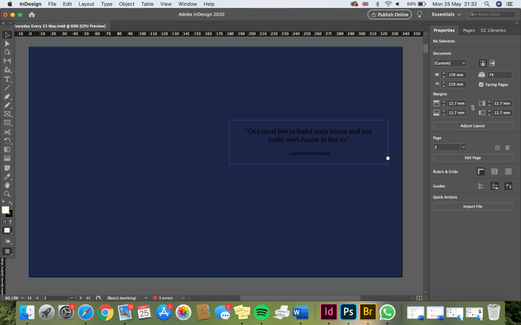
For the first page, I wanted to have a bit of space before jumping into the photos. As discussed previously, I wanted to include a quote from Gaston Bachelard’s ‘The Poetics of Space’ as I was hugely inspired by this when I read through some of his work. I chose to include the quote:
“One must live to build one’s house and not build one’s house to live in.”
I feel this quote strongly represents what I am trying to say through my images; it explains how the ordinary, everyday space we exist in is such a fundamental part of who we are. It’s also short, simple and straight to the point.
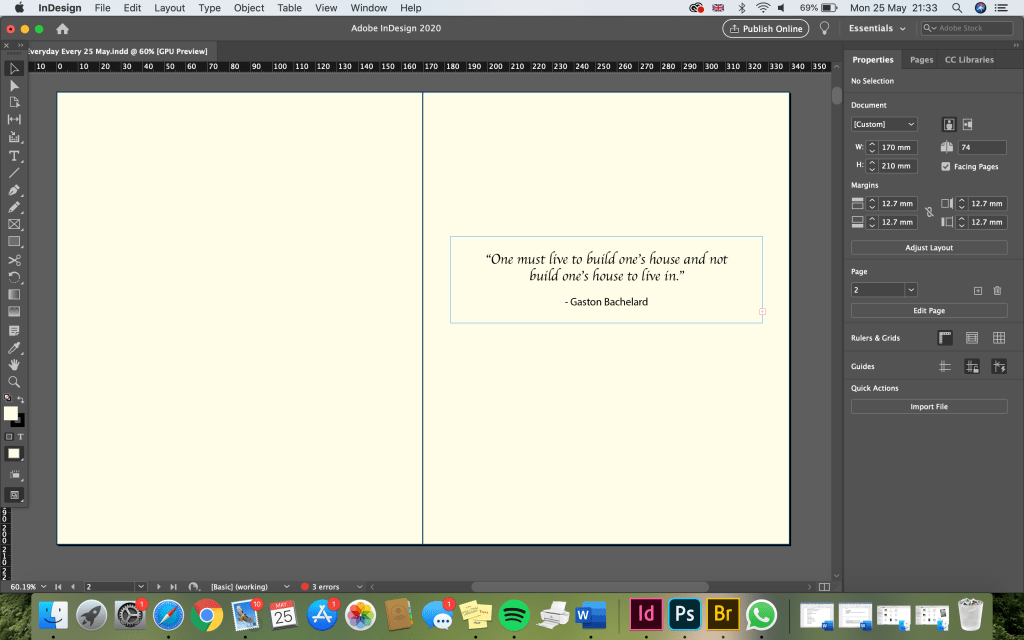
I prefer this colour to the blue colour for the inside pages. I chose something slightly off-white so that it looks like real diary pages. I think the writing looks best when it’s slightly smaller (below) because it looks more sophisticated. I think the font works well and I will most likely use a similar font for the diary entries throughout the book. Ideally, I would have handwritten the text to add to the diaristic style, however as I’m not making a physical book and I have no way of scanning in the text, I want to use a font that looks like handwriting.

